

Palmtech has introduced four new interactive report layout options in the Report Designer that let you control how your report is built and shown to clients. Instead of one standard look, you can choose from multiple layout styles – like a narrative flow or a high-impact grid – to find the one that best matches your branding and your client’s needs.
When we launched Palmtech 11, the goal was to make your report writing faster. But what good is speed if your reports don’t look the way you want them to, or if the layout makes it hard for your clients to find the info they’re paying for? This update gives you the power to pick a layout that fits your specific brand and helps your clients and agents review your findings without a headache.
The Interactive Report Layout update includes these capabilities:
- Visual layout selector: Use preview cards to see exactly how each style looks before you pick one
- Real-time preview: Pick a layout and the preview updates instantly – no guessing
- Interactive side panel: Clients can click a finding to see details in a side panel, so they don’t lose their place in the report
- Mobile ready: These layouts look sharp on a phone at the job site or on a desktop in the office
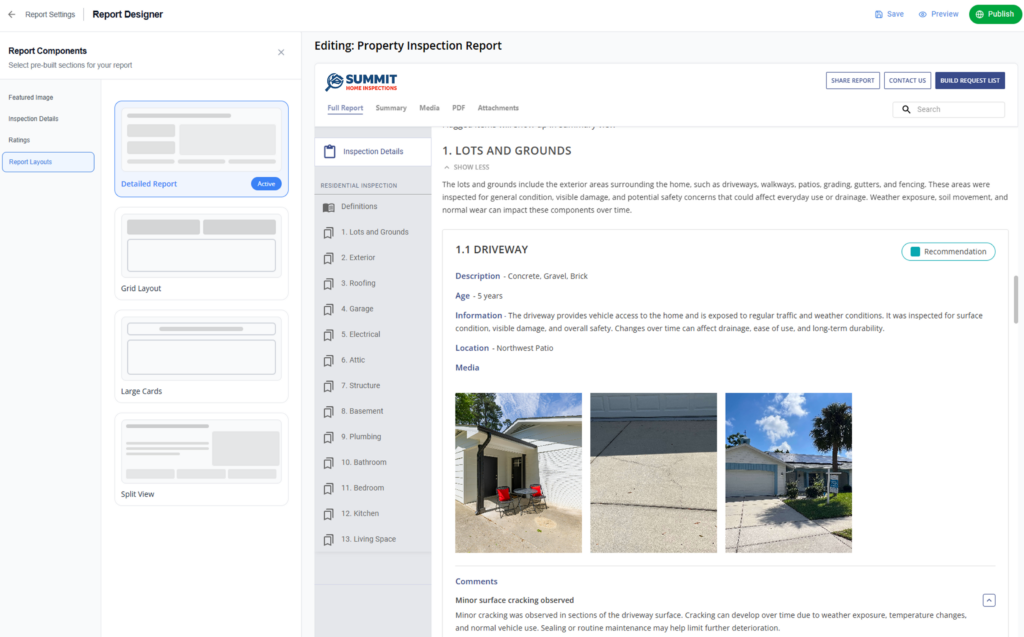
Style 1: Default Layout
Best for:
- Inspectors who prefer a structured, narrative-forward presentation
What’s included:
- Category view: Introductory text is open by default with a “View Less” call to action
- Card structure: Each line appears in a rounded card
- Content: Displays line name, description, and full comments within the card
- Media: Show ratings, associated media thumbnails, and total media count
Value:
- Familiar, professional structure closest to classic, traditional layouts
- Strong visibility of written observations
- Detailed information appears upfront without requiring extra interaction
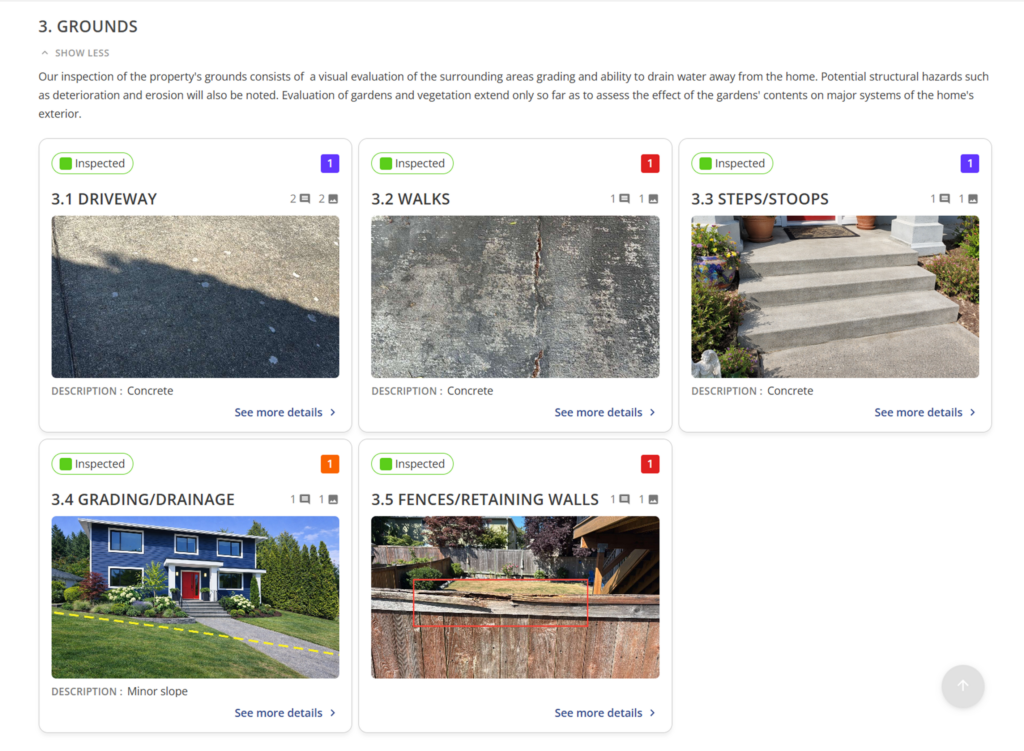
Style 2: Grid Layout
Best for:
- Inspectors who want a highly visual, scan-friendly report
- Buyers who want quick insights – they’ll get the summary first and the details on demand
What’s included:
- Category view: Each category appears as its own distinct block
- Arrangement: Responsive grid with 4 line cards per row
- Each grid card includes: Line name (top left), ratings count (top right), location, line description, and one main media thumbnail
Value:
- Highly scannable for buyers who want quick insights
- Makes the report feel like a modern, interactive app
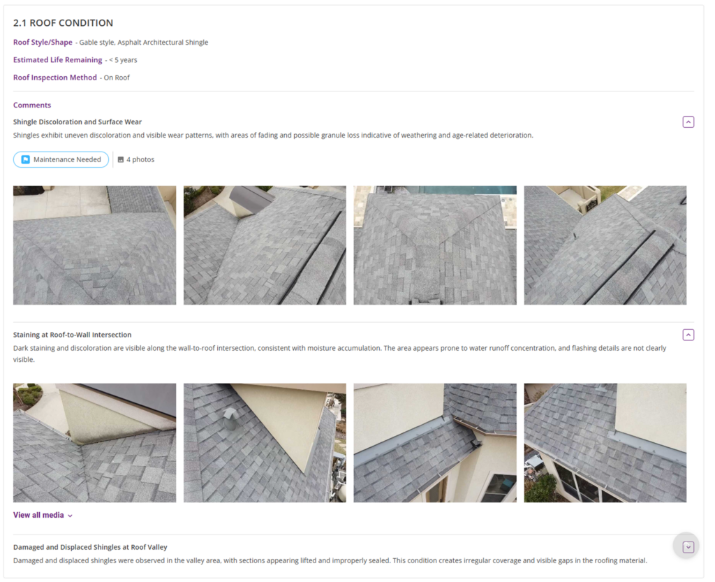
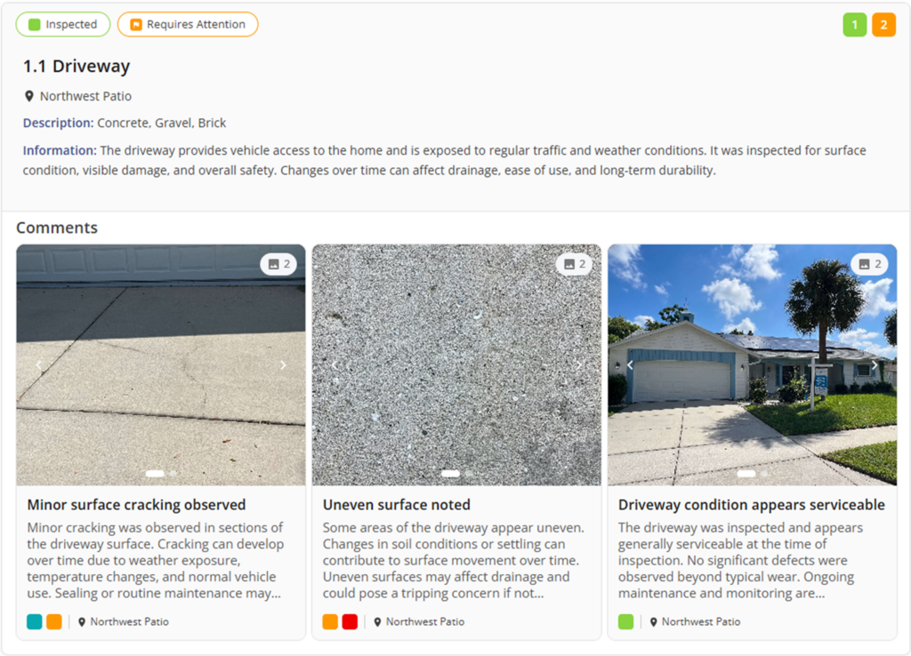
Style 3: Large Cards Layout
Best for:
- Inspectors who want a highly visual, media-forward presentation
What’s included:
- Each card includes: A massive image or media carousel at the top, line name, and key details below
- Technical Details: Displays comment, photo, and video counts
- Badges: Shows rating summary badges, such as Recommendation, Requires Attention, Inspected
- Included info: Line descriptions and supporting information
- Interaction: All line cards are clickable to open the detailed side panel
Value:
- Large, high-visibility images make defects impossible to ignore
- Creates a strong balance between imagery and explanation
- Photos carry equal weight as written findings
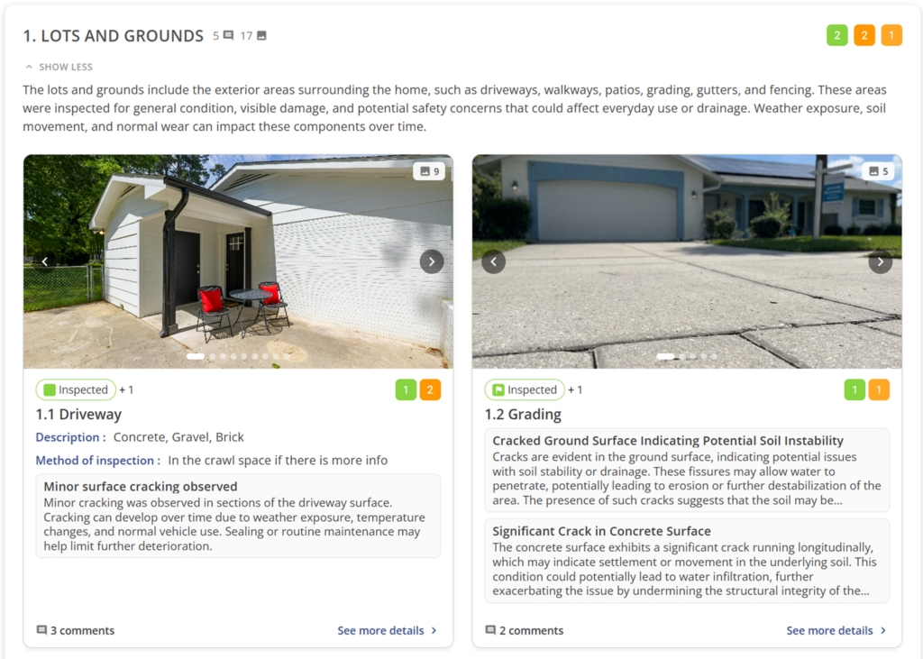
Style 4: Split View Layout
Best for:
- Inspectors who want to see line details and media side-by-side in a balanced format
What’s included:
- Arrangement: Wide, horizontally split cards
- Card Content: Line name at the top; details (materials, location, ratings) on the left; large media or carousel on the right
- Details: Displays rating summary badges and comment/photo/video counts
- Comment Cards: Individual media cards below the line, each including:
- Comment image/thumbnail (with carousel support)
- Comment title and description
- Location and assigned rating badge
- Interactive Media: Media thumbnails support carousel browsing so clients can swipe through multiple images without leaving the card
Value:
- Balanced presentation that doesn’t hide text behind photos
- Easier for clients to connect descriptions with visual evidence and review findings without switching between summary and detail
- Seamless navigation – all line sections and comment cards remain clickable to open the detailed side panel for a deeper dive
- Creates a clean, modern reading flow
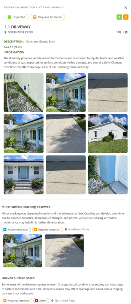
Interactive Line Details (Side Panel Experience)
With this option, your clients get a smooth detail view. When a line item is clicked:
- Side Panel: A panel slides in from the right with the full breakdown
- Context: The main report stays visible (and dimmed) in the background, so you never lose your place
- Speed: An “X” allows for quick closing – no full-page navigation or “back button” required
Don’t let a bad layout ruin a great inspection
Your report is the only thing the client keeps once you leave the driveway, so it needs to look as sharp as the work you did on-site. An impressive report doesn’t just close the loop on a job – it answers questions, wins referrals from clients and agents, and builds a brand that sticks. And just a quick reminder, we recently added the ability for inspectors to control what client data and property details appear in your reports.
These layouts are just the start of where we’re headed with the Report Designer!
Ready to see the difference for yourself? Try Palmtech for free and start delivering reports that match your style.